Two collections in and Daniel Lee has quietly done the inconceivable.
The Burberry check has gone. And about time too.
Brand motifs were becoming bit of an albatross under previous CD, Ricardo Tisci. A romantically inclined designer with brave, sweeping ideas, was his vision ever truly embraced by a demographic that generally comes to Burberry for more conservative cuts? Covid19 also put the brakes on some bold Asian expansion plans.
A changing of the guard saw Bottega Veneta designer Daniel Lee take the reins last year, having formed a reputation at BV for desirable, definitive objects, and that pacification of logo and motif.
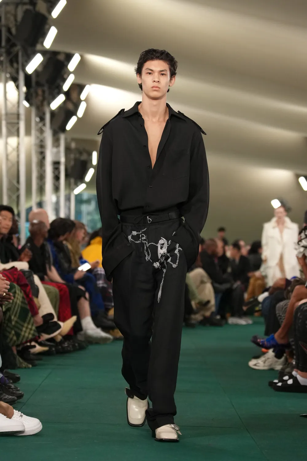
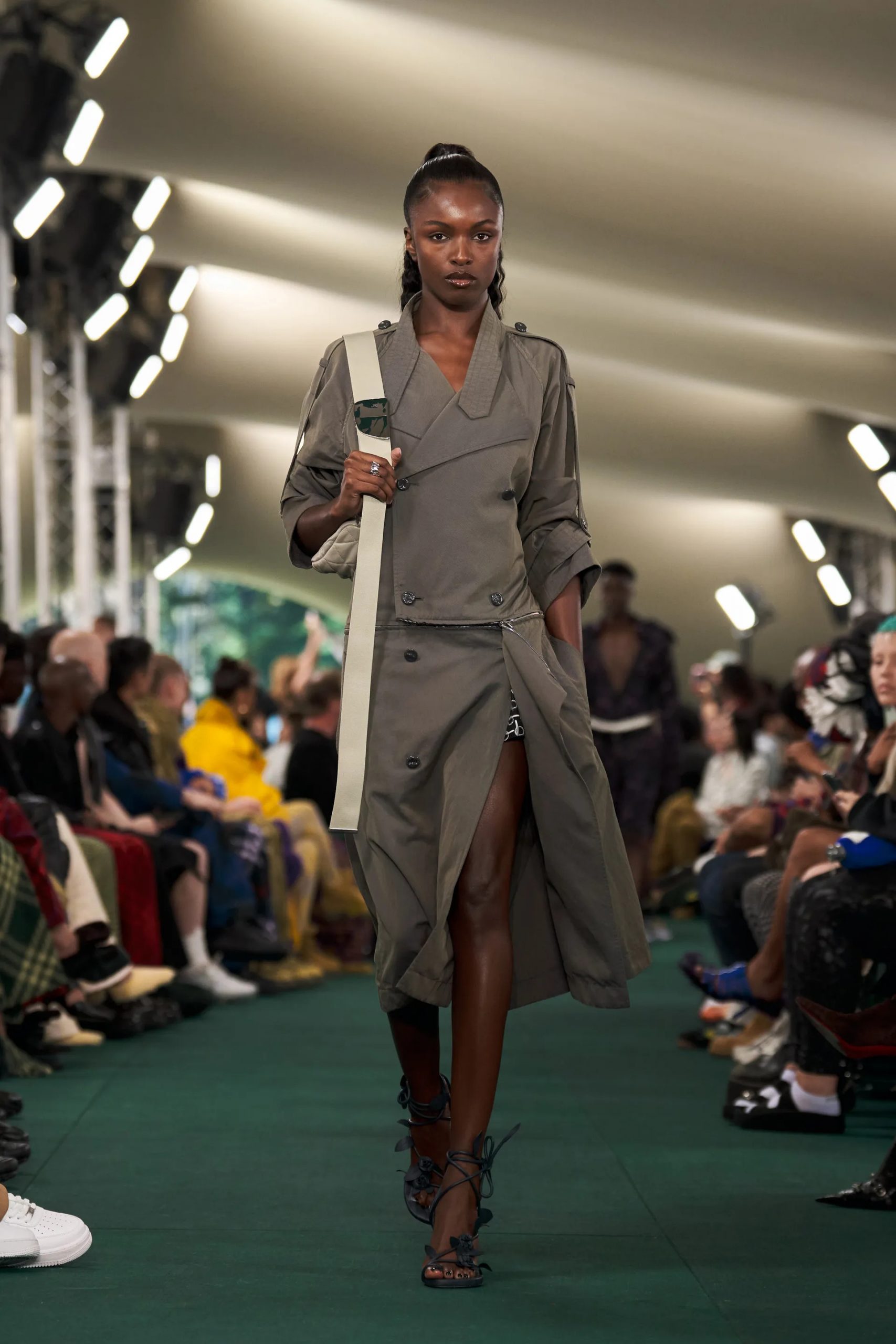
Burberry is a – sometimes unnecessarily – complex label. Founded in the good old days before fashion was even a thing. Then, when fashion became a thing, Burberry became less fashionable, established as it was on some rather rigid fundamentals – gabardine, unform, check – that proved unwieldy, even as stock rose.
Lee, of course, is tasked with repurposing those elements. For SS 24, carefully avoiding ostentation communicates his sober adherence to the task, while a thankfully evolving from his shadowy A/W effort.
Crispness and sturdiness impress immediately. Demoting the flying horse and the red-black-white lines demands more tailoring acumen, something that Tisci, it must be emphasized, had in abundance, but that he diffused with external themes (the ocean, Italy) and layers that confuscated rather than enlivened.
The ill-fated Burberry Black Label line appears a reference for the more masculine formals on display now, also in keeping with the US-market focus on sleek business wear that remains a USP when Burberry falls short in the experimental stakes.
What about those sneakers – a successful invasion of Balenciaga territory recently , and surely something Lee, creator of the legendary Lido Sandals, would be keen to develop?
There are some Vans-type slip-ons, differing to what goes on upstairs, but those expecting an athleisure super trainer will be shopping elsewhere.
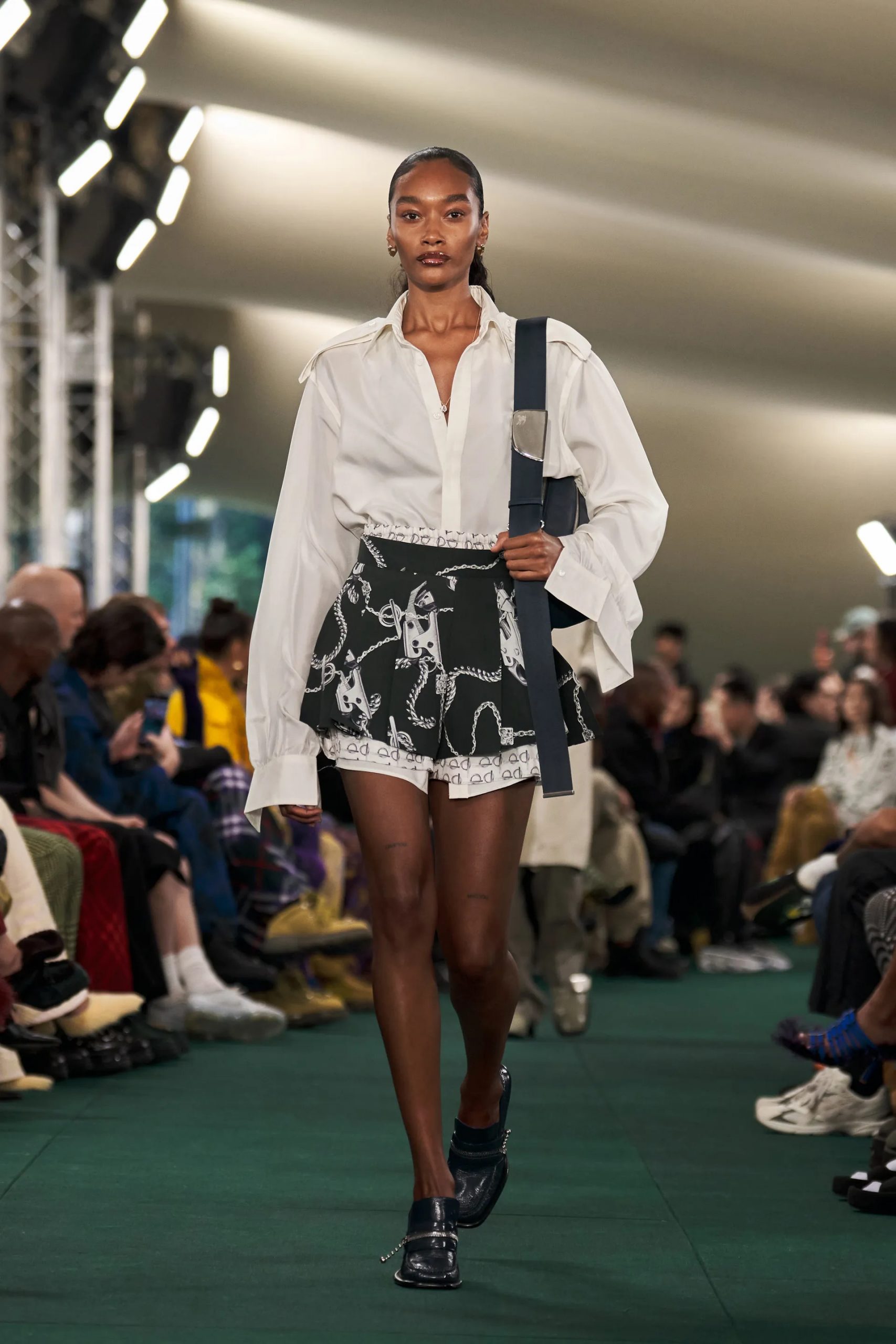
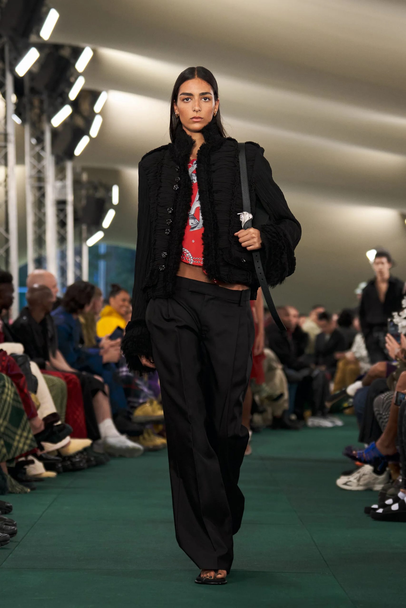
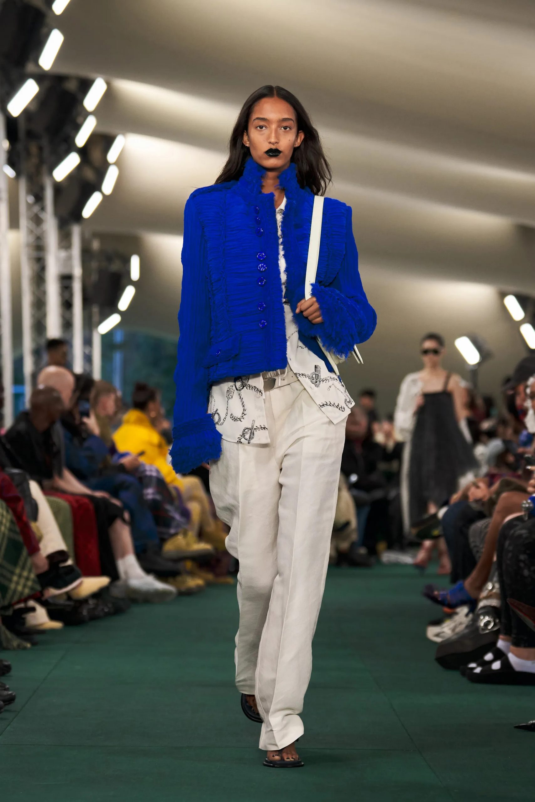
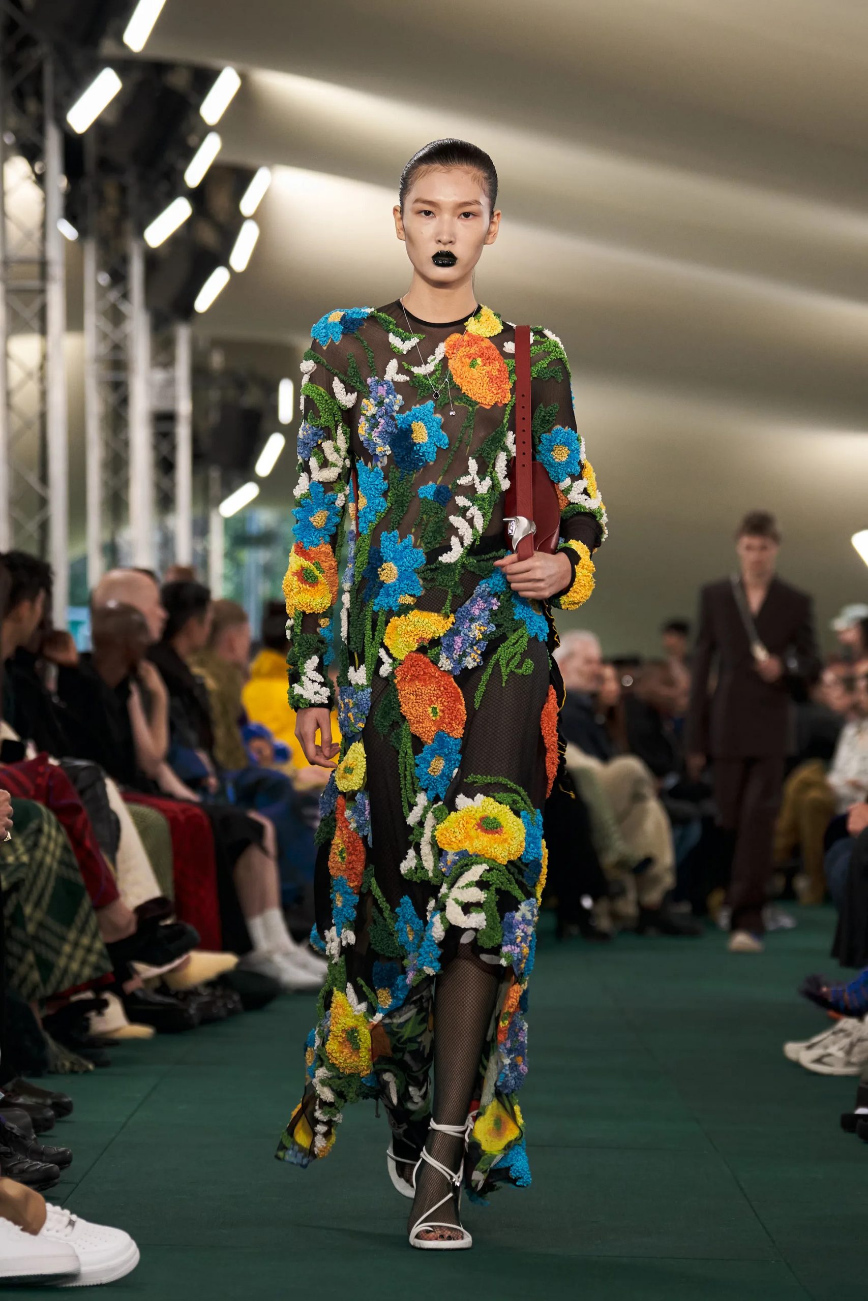
Lee has used jet black as a neutral base for some the kind of florals that simply jump out with precision and – again subverting the logo – chain and metal punch emblems thar are not proto-Burberry at all.
In some ways the sharpness is similar – in color and in dynamism – to Gucci‘s recent resort collection. But whereas the Italian label continued to pushed their anti/sports dynamic to a kind of hybrid limit, Lee has kept the easy going feel through ensembles and ambiance.
It’s something that Vogue commented on, his remark about not wanting to mess around with the trench coat too much, and the use of ‘we’ rather than ‘I’ – is not managed.
Lee is still selling an ideal after all, but not one grounded in ephemeral concepts or leaning too heavily on brand loyalty. When Burberry gets the basic right, it is strong.
In Lee they have someone who understands that and wants to expand by drawing the lines and folds in interesting and flattering places. So far, so good.